
Dapple
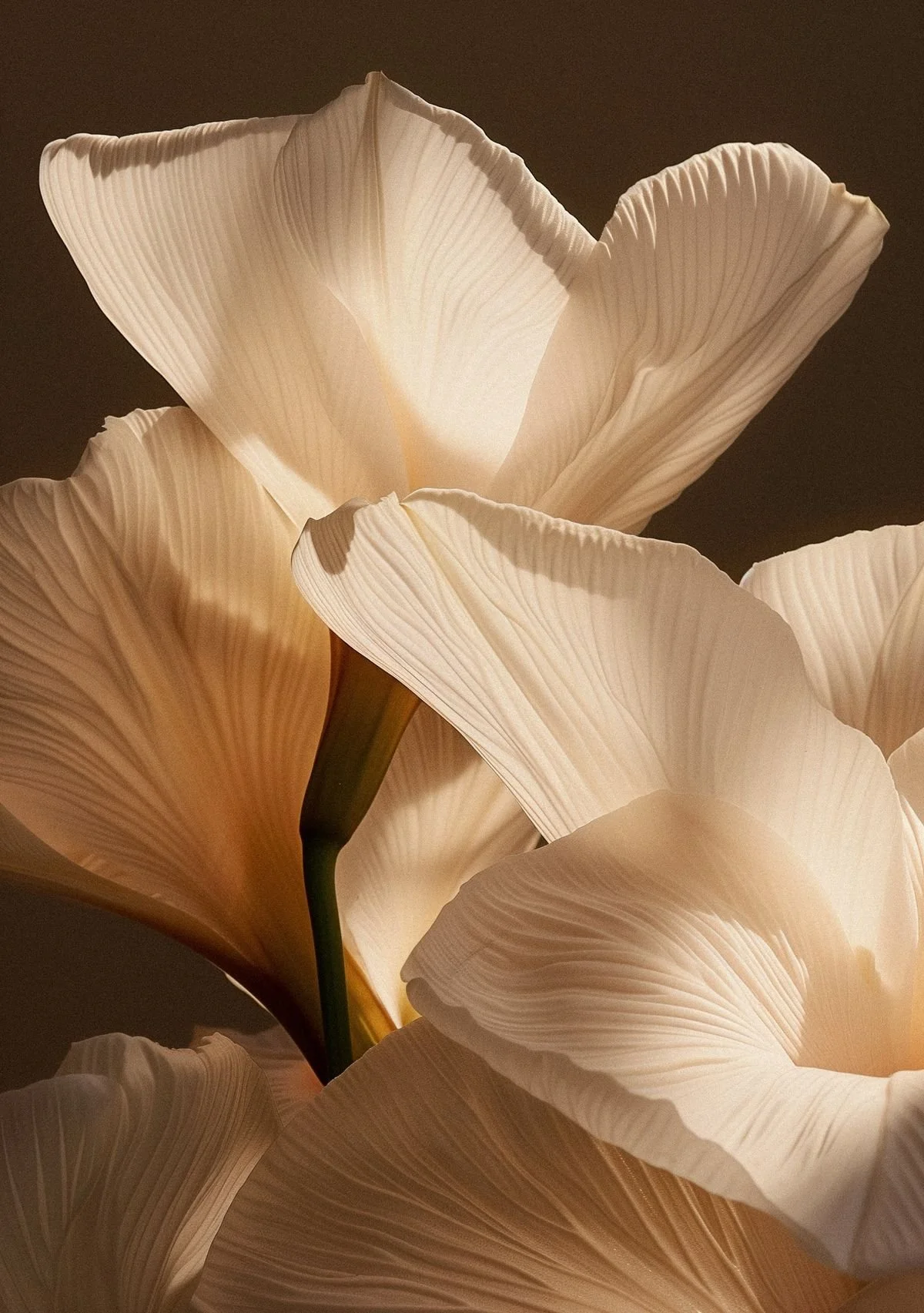
Dapple is a creative floral studio that sees flowers as the truest expression of emotion.
As the business launched, they needed a refined brand identity that reflected their thoughtful, seasonal approach to floristry while positioning them confidently within the premium market.
The project focused on creating a timeless visual identity system that felt elegant and expressive, while remaining practical enough to support the studio’s growth across digital and physical touchpoints.
Scope: Brand identity & logo design
Focus: Premium positioning, typography, visual system
Deliverables: Logo suite, colour palette, typography, brand guidelines
The Challenge
Dapple needed a brand identity that could balance artistry with clarity.
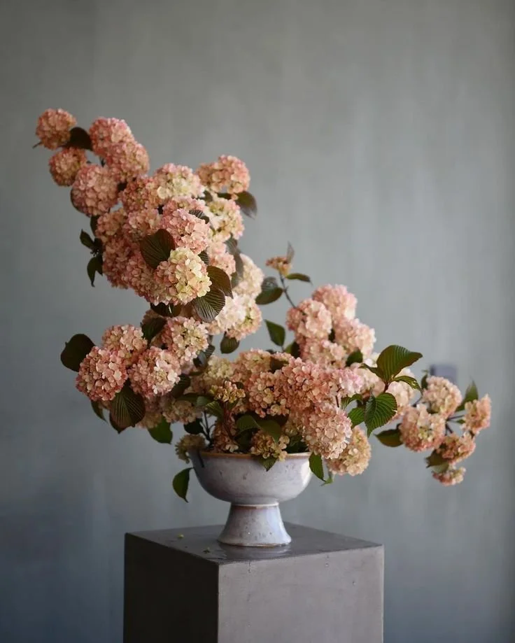
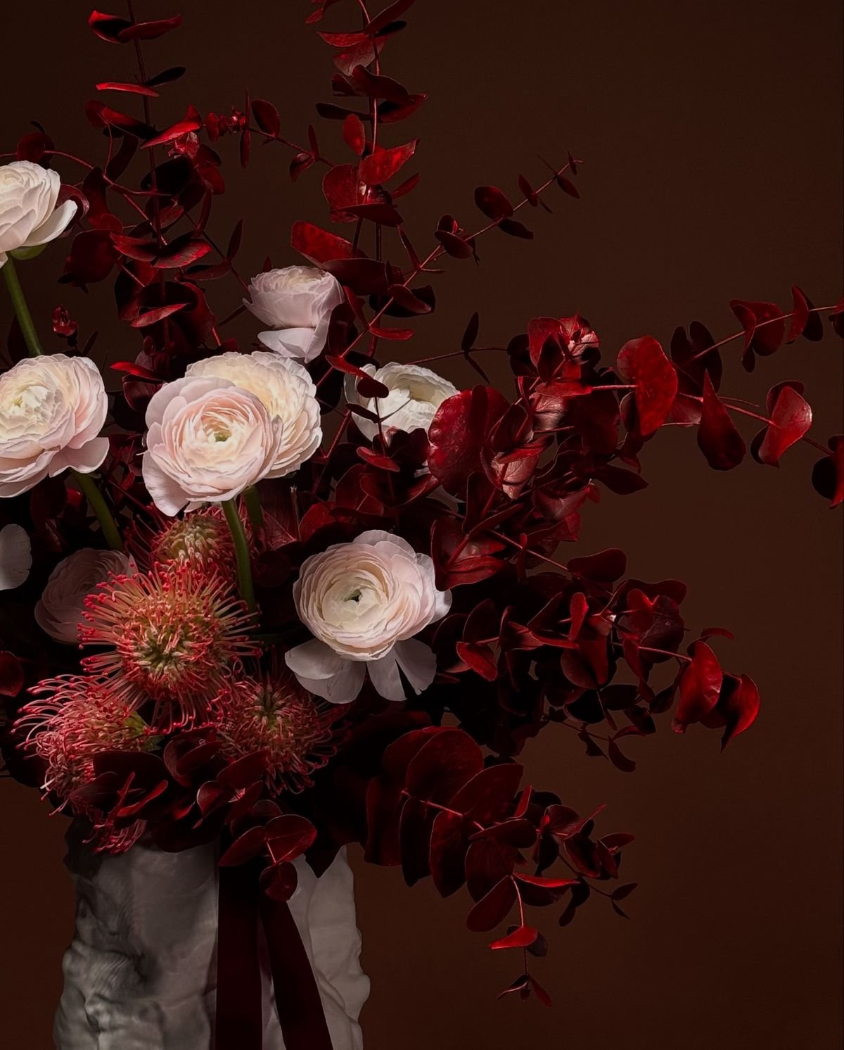
As a creative floral studio, the brand had to feel emotive and refined, without becoming overly decorative or informal. The identity needed to communicate quality at first glance, while remaining versatile enough to work across a wide range of applications, from digital platforms to printed materials and physical branding.
The challenge was to create a visual system that felt distinctive and premium, while still allowing the floristry itself to take centre stage.
The Approach
The brand identity was built around restraint, texture, and timeless design principles.
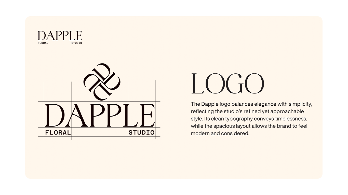
A refined logo system was developed to balance elegance with simplicity, using clean typography and generous spacing to create a sense of confidence and calm. The logo mark was designed to work both independently and alongside the full wordmark, allowing flexibility across different contexts.
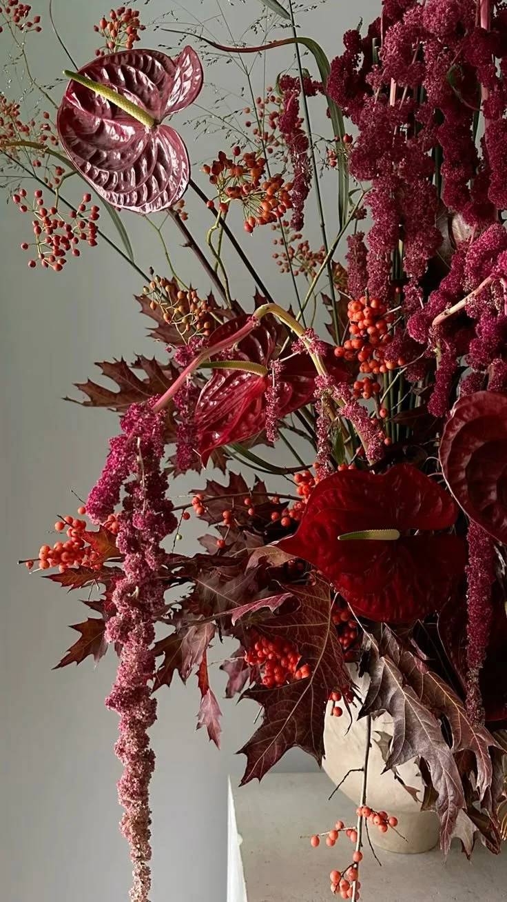
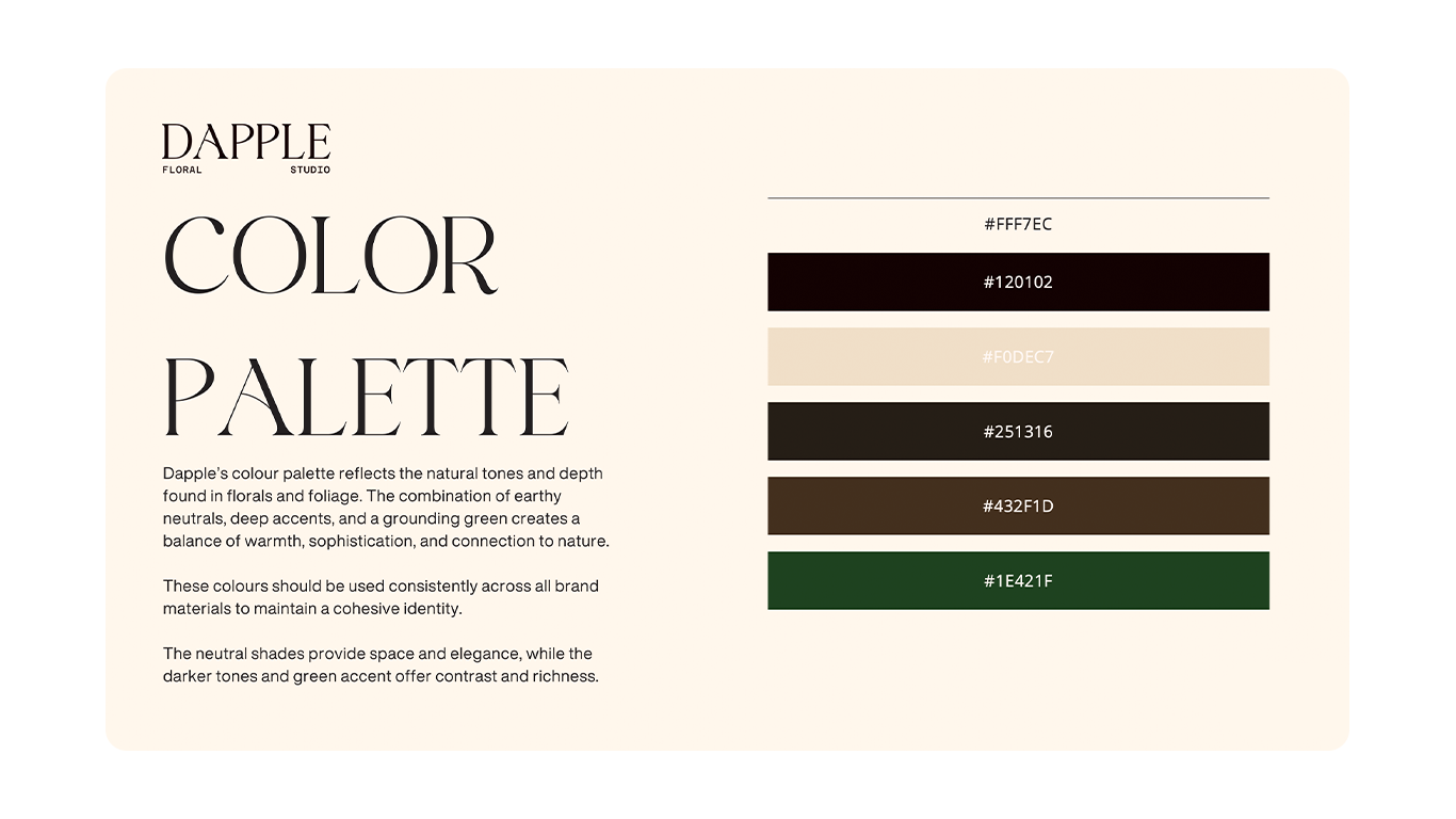
Typography played a key role in shaping the brand’s voice. A considered type system was introduced to combine sophistication with clarity, ensuring the brand felt both expressive and usable across digital and print applications. A warm, earthy colour palette was selected to reflect the natural tones found in florals and foliage, reinforcing the studio’s connection to seasonality and craft.
All elements were brought together into a clear set of brand guidelines to ensure consistency as the business grows.
The Outcome
The result is a cohesive, timeless brand identity that positions Dapple confidently within the premium floral space.
The new visual system provides the studio with a strong foundation. One that feels refined and expressive without overpowering the work itself. With clear guidelines in place, the brand can now be applied consistently across marketing materials, digital platforms, and collaborations, giving Dapple a confident and recognisable presence from launch onwards.
LET’S TALK
Have a project in mind?
Get in touch to discuss your requirements.