
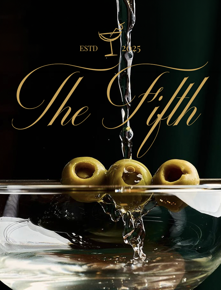
The Fifth
The Fifth is a speakeasy-style cocktail bar in London, built around the idea that the best nights are the ones that feel like a secret. As the bar launched, they needed a brand identity that could carry the weight of that atmosphere, something that felt theatrical and atmospheric without tipping into gimmick.
The project focused on creating a visual world as compelling as the experience itself, one that would draw people in before they'd even crossed the threshold.
Scope: Brand identity & print design
Focus: Atmosphere, premium positioning, physical touchpoints Deliverables: Logo suite, colour palette, typography, brand guidelines, print collateral
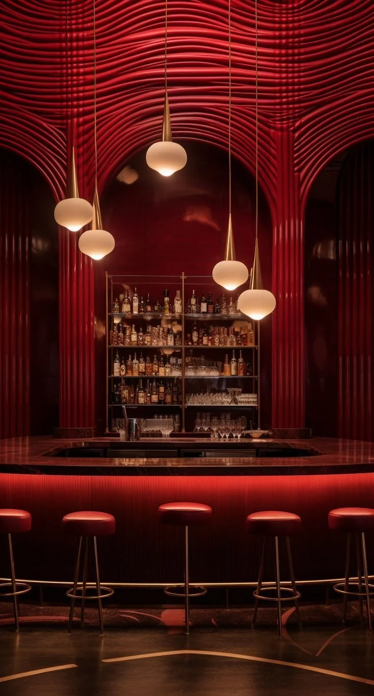
The Challenge
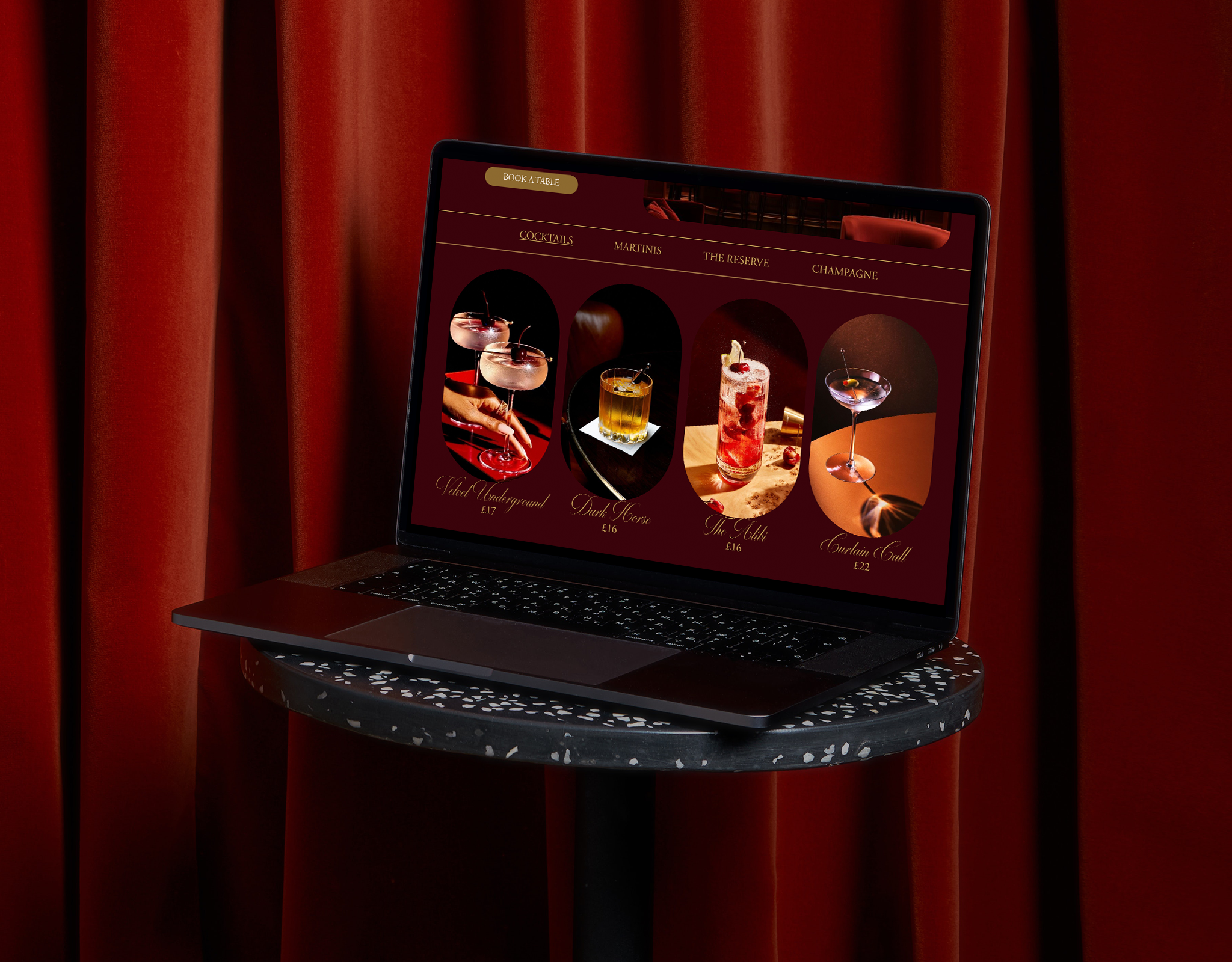
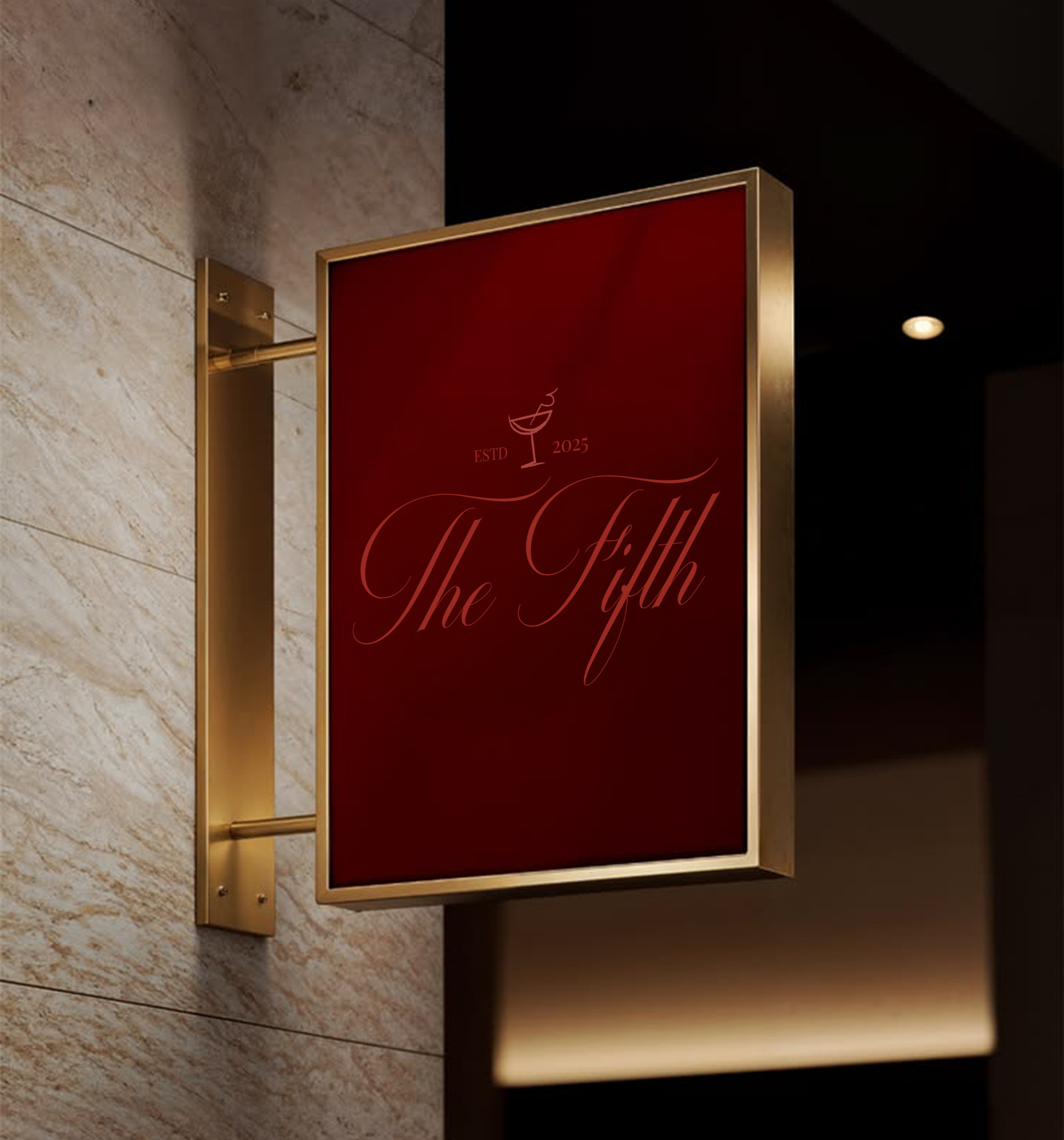
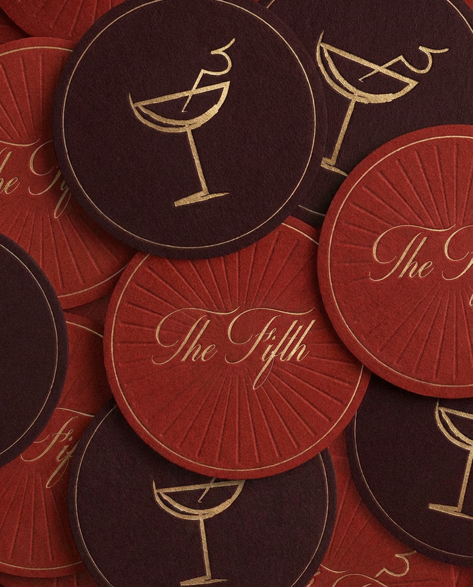
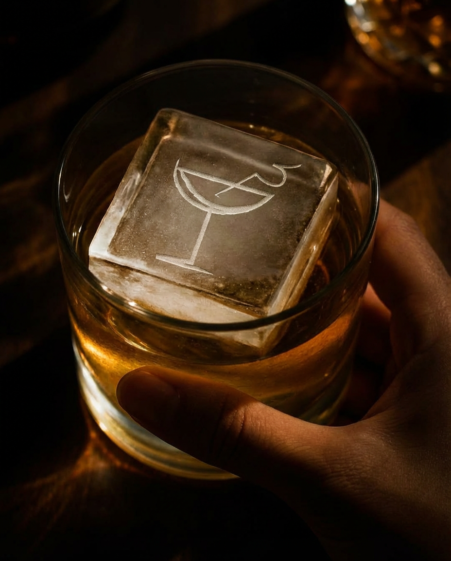
The Fifth needed a brand that could do what a great speakeasy does - create intrigue, signal quality, and make people feel like they're in on something. The challenge was striking the right balance between drama and restraint. Lean too far into the theatrical and the brand risks feeling costumed; pull back too much, and it loses the atmosphere that makes the concept worth visiting. The identity also needed to work hard across physical touch points, from signage and menus to coasters and glassware, where craft and finish matter as much as the design itself.
The Approach
The identity was built around two contrasting forces: the romance of old-world elegance and the quiet confidence of something that doesn't need to announce itself. A flowing script word mark became the heart of the brand - expressive and cinematic, with enough presence to hold its own across large-format signage and intimate print applications alike. A minimal cocktail glass icon was developed to sit alongside the word mark, offering a versatile mark that translates seamlessly from embossed menus to engraved ice blocks.
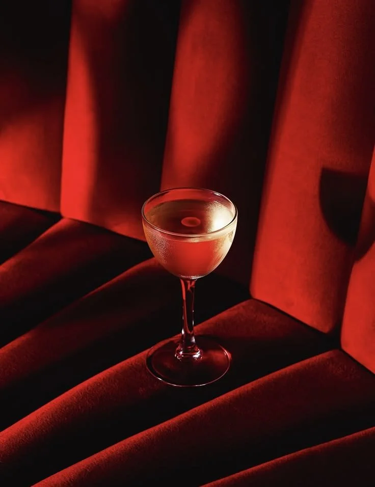
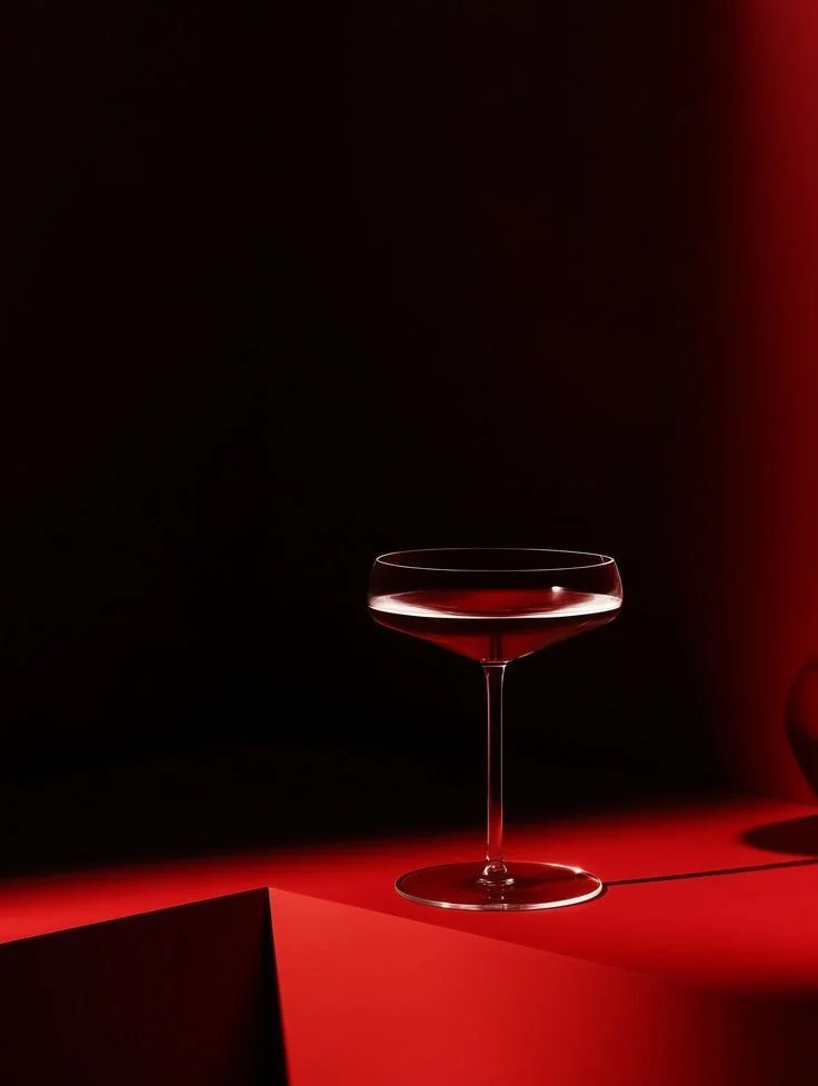
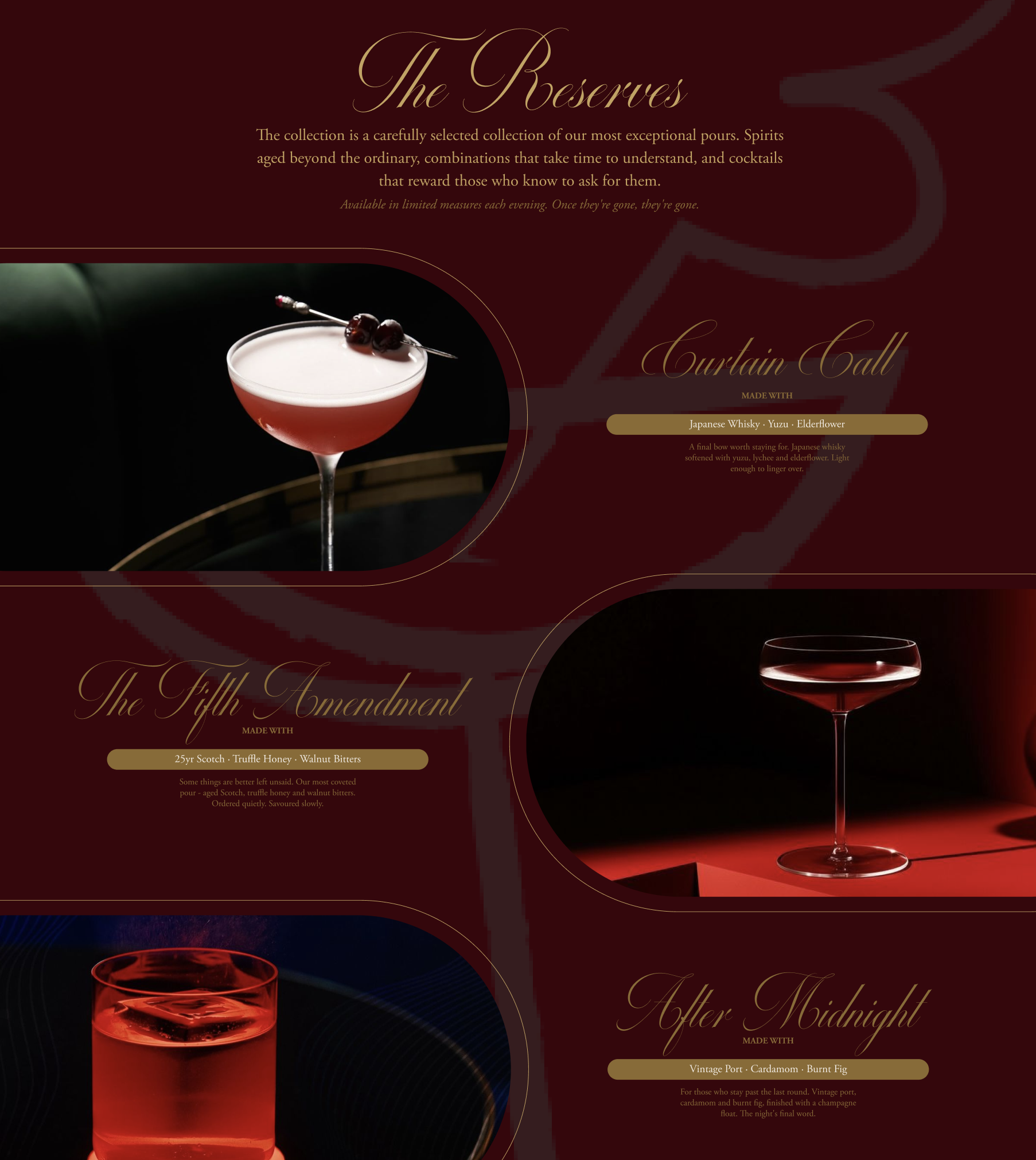
The colour palette anchored the identity in deep crimson and near-black, punctuated by warm gold - colours that feel like candlelight and red velvet, familiar to the world of late-night luxury. Typography drew on the contrast between the fluid script and the structured precision of Adobe Garamond Pro, giving the brand range across atmospheric and informational contexts. Every touchpoint was designed to feel like it belonged to the same hand, from the leather-bound menu to the foil-printed coasters, ensuring that the brand is felt as much as it is seen.
The Outcome
The result is a brand identity that holds the same atmosphere as the bar itself - rich, deliberate, and quietly seductive. The visual system gives The Fifth an immediate sense of place, positioning it as a destination rather than just a venue. With a strong identity in place across both digital and physical applications, the bar launches with a brand that is as memorable as the experience it promises.
LET’S TALK
Have a project in mind?
Get in touch to discuss your requirements.